
judging a record by its cover
|
I like this Very Secretary cover a lot, simply because it features what I couldn't do successfully if you paid me: non-digital art. Yay for Dave and company for doing this snazzy little number. It's rather refreshing to see such vivid color on a stark background. |
|
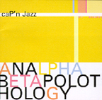
In eighth grade, I ran for class president. My opponent, Jim Knapp, made posters that read "Simple. Honest. Jim." Jim won the election. And this simple Cap'n Jazz cover wins the award for loverly design! It's clean, mixing the classic with the modern. I am curious, however, about that capitalized P in the caP'n -- looks like somebody has been reading the DeLiA's catalog lately. |
|
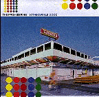
Dot dot dot dot dot dot! dotdotdot! Hi! We're the Promise Ring, and we really like dots! I like the Promise Ring a lot, and I honestly enjoy this cover; but there's something a little Partridge Family-esque about the whole thing. Yipes. I do enjoy dots, but this is almost overkill. Still, the photograph has lovely perspective. And the color! So vivid! Yay Promise Ring! |
|
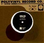
This Braid record was for sale at Michigan Fest, and I'm kicking myself because I didn't have the sense to purchase it. Never mind what the record SOUNDS like; the design is simply delicious. The record sleeve is positioned so that the label on the record (the black part) is slightly off center. The paper has this marvelous texture to it, like worn-in khaki pants. I've got to find this record, and when I do, I'm going to frame it. |
